Workit Health hosted a team of four grad students for Alternative Spring Break. They worked to create innovative solutions for addiction with Workit’s team in a brief trip to the Bay Area.
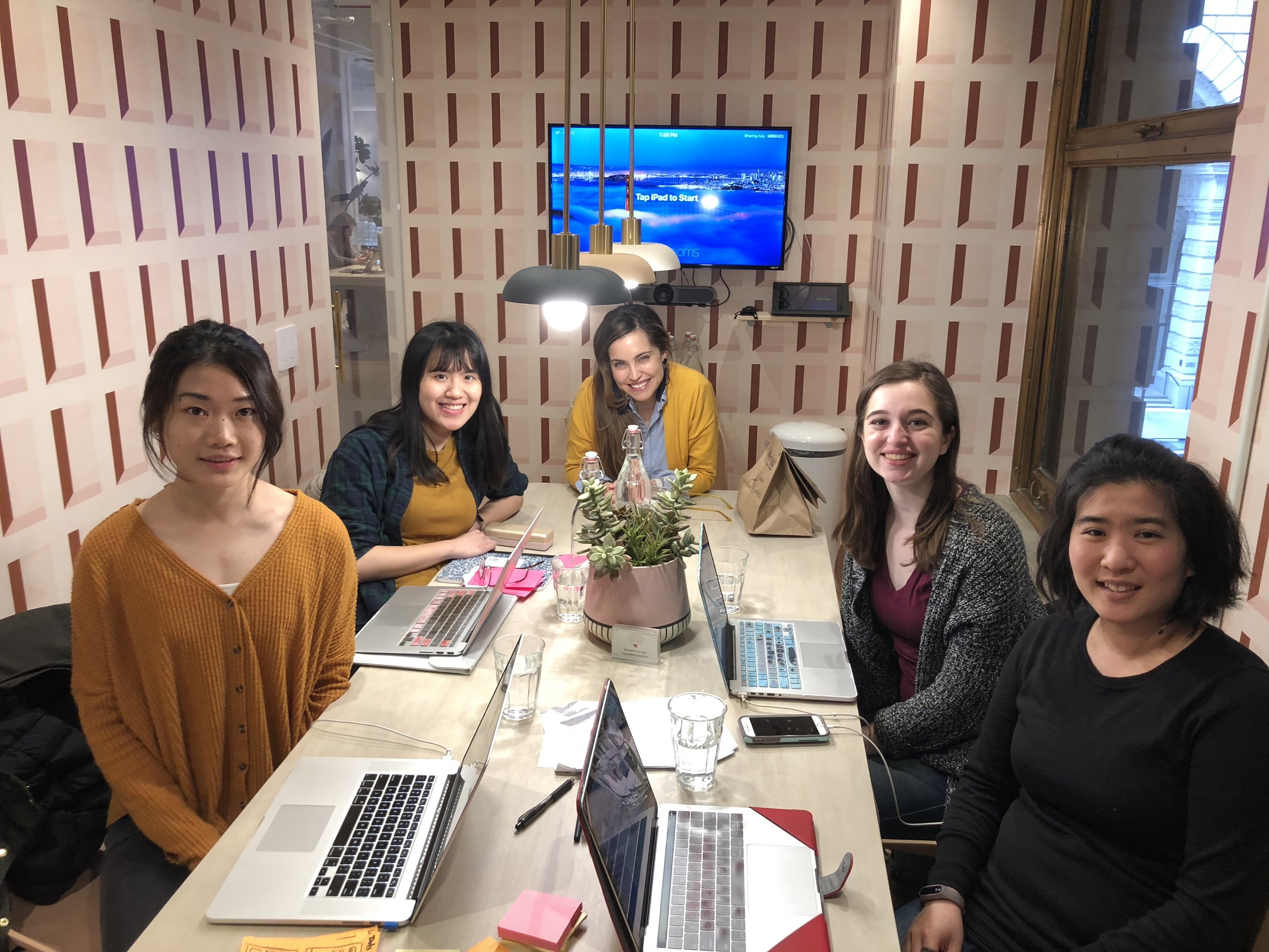
This spring, we welcomed a team of four graduate students from the University of Michigan School of Information focusing in User Experience Research and Design for an Alternative Spring Break. The goal was to work with Workit Health in San Francisco, improving Workit member experience with the mobile app. On most days within the week, we worked at a conference room in The Wing, a co-working space in downtown San Francisco that is designed for women.
Expectations and Design Insights
On Monday at The Wing, we met with the CEO & co-founder of Workit Health, Robin, to clarify her expectations and our assignment for the coming week. Robin has an award-winning design background, and brings that experience to Workit’s program. Robin walked us through the online courses and treatment program Workit members go through when they begin their program. This helped us better understand the context we were working with. The special guest presenter was Robin’s husband, Beau, who runs the design firm Founders & Co, and previously worked at IDEO. He shared insights into the design processes, and provided some rules of thumb for prototyping rapidly.
After Beau’s presentation, Robin dived back into explaining our mission for this week. Workit Health challenged us to build out a top-secret moonshot project which included innovative new interactive features for the member dashboard. We walked through the current look of the app with Robin and heard a few of her ideas about the project. Before the end of the day, we scheduled interviews with Workit’s Marketing and Counseling teams to receive further insight.
Entrepreneurship and Defining the Audience
Tuesday morning at our Airbnb in Oakland, we interviewed Kali, Workit’s Head of Marketing, and Brooke, Workit’s Head of Care Management. We did a deep dive into the audience that we’re designing for. This is crucial, as Workit is focused on human-centered and patient-led design. When we returned to The Wing, we had a guest presentation about entrepreneurship from Kate Harris, co-founder & creative director at SIREN. We found this was inspirational for our future career paths! Afterwards, we consolidated the key information from our interviews and researched user feedback regarding Workit Health’s current program.
Pinterest and Prototyping
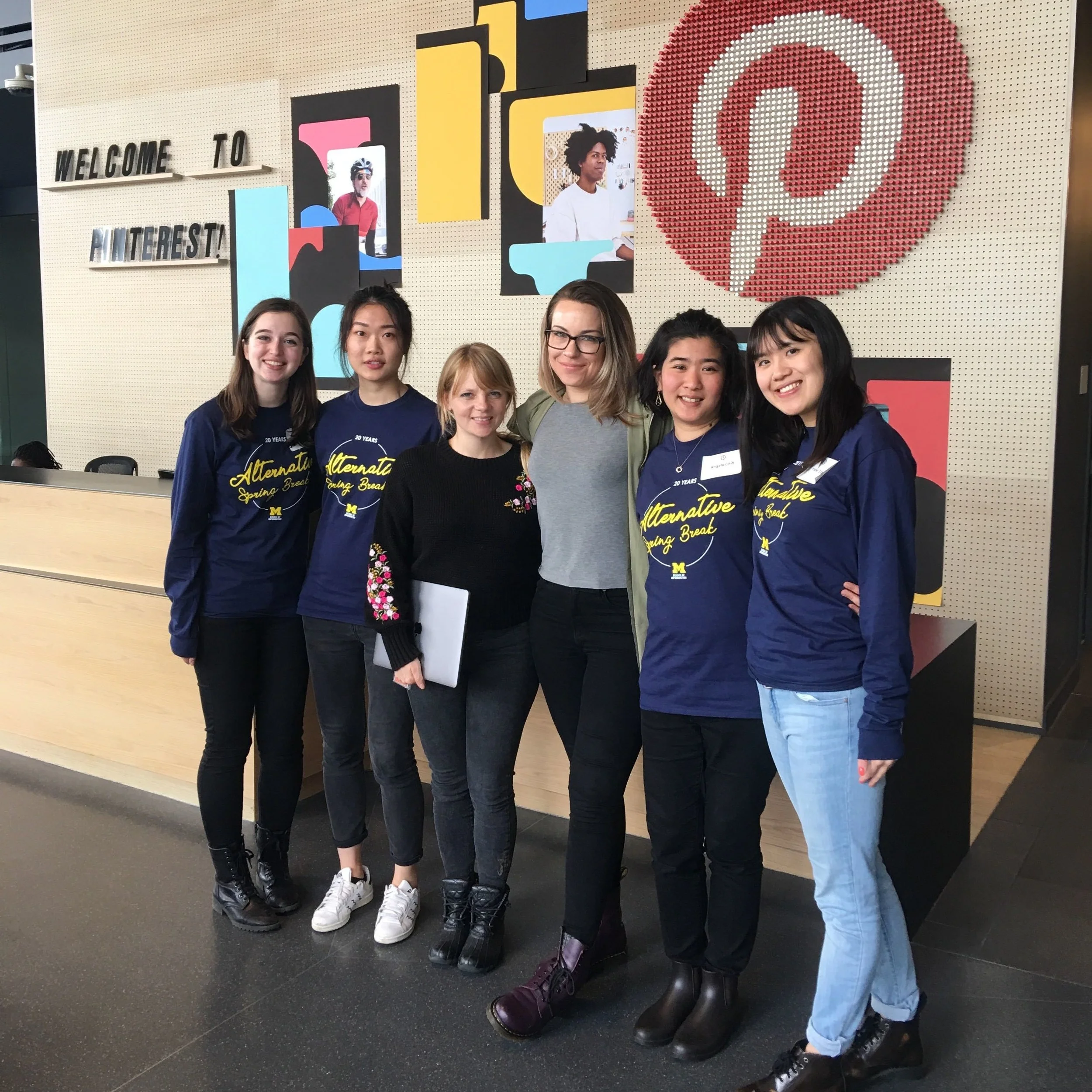
On Wednesday, we met with Amy Compeau and a few other designers from Pinterest for lunch, and learned about what they do and their design process. Afterward, we headed to the Workspace Cafe for a few hours to sketch out our ideas. We began prototyping high-fidelity mockups. Since we had such a short time for the project, we paired up and split the work. We designed prototypes of a brand new section of the app. Time was flying, and Thursday was already our second to last day! We touched base with Robin to make sure we were on the right track. We finalized our designs and worked on our presentation together.
Presentation Day
Friday morning was presentation day, so we headed into San Francisco one last time. We presented our designs to the entire Workit team, including Counseling, Development, Marketing, and Design. We demonstrated our objectives, background research, and brainstorming with our sketches and high-fidelity prototypes. In the demonstration, we explained why we made certain design decisions and provided additional recommendations.
What an amazing experience! We learned a lot about how to design for an audience we may be unfamiliar with. We had to ask a lot of questions to become as familiar as possible with the problem space of helping people with addiction. This taught us how to ask the right questions to get those answers, especially without access to the patients directly. The tight deadline was a valuable learning experience, as well. We went from being unfamiliar with the problem space to producing high-fidelity prototypes within a week!
